Mobile Bottom Navigation Bar

Done

The mobile bottom navigation bar component is used for triggering navigation between four districts and/or buckets in the app, and one additional trigger for the global navigation view. With a total of five possible triggers, the mobile bottom navigation bar is the primary way mobile users jump between the highest value areas within the app.
Mobile Bottom Navigation Bar

Anatomy

The essential parts of the mobile bottom navigation bar component are the raised low-emphasis surface, up to 4 triggers for navigating to districts or tasks, and a trigger for navigating to the global navigation view. The mobile bottom navigation bar is also responsible for providing extra vertical space as needed for the iOS and Android home gesture UI.

Similar to the text field component, the mobile bottom navigation bar component offers unique styling profiles that dramatically change the look and feel (see theming for more details on the styling profile options). 

  1. Container 
  2. Icon - Small Avatar
  3. Trigger container — Snowflake styling treatments
  4. Label — Snowflake type treatment 
  5. Divider
  6. Extra space for iOS/Android home gesture UI (optional)

Specs

Color

The mobile bottom navigation bar uses a low emphasis raised surface as the parent container for the component. All colors associated with the raised surface are documented in the surface component. Colors specific to the avatar and icon are as follows:

Element Property Value
Static trigger label Text color ∆colorPlatformGray600
Selected trigger label Text color ∆colorPlatformGray600
Static trigger avatar Background color ∆colorPlatformAlpha0
Static trigger avatar Icon color ∆colorPlatformGray600
Selected trigger avatar Background color ∆colorPlatformAlpha0
Selected trigger avatar Icon color ∆colorGuidanceAccessible

Elevation

No elevation considered for this component.

Spacing

Triggers

Vertical spacing between the avatar and label is a snowflake spacing at just 1px.

Triggers should respond to the width of the device dynamically — the width of each trigger taking up a certain percentage of the width of the screen, with all triggers combined equaling 100%. 

Note: There will always be at least two triggers for “Accounts” and “More”, and not every customer will have every widget configured for every user.

Number of triggers Width of each trigger
2 50%
3 33.33%
4 25%
5 20%

With home gesture UI 

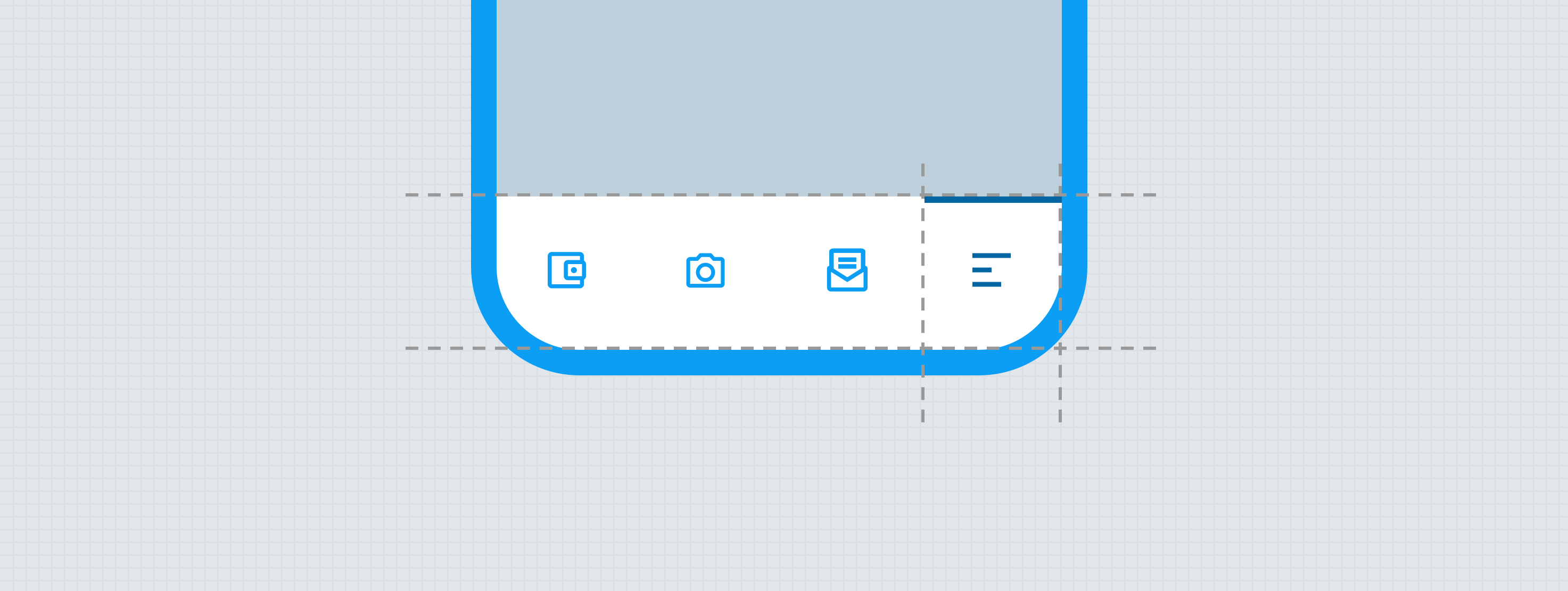
When the home gesture UI is present, additional space is added to ensure all the triggers remain within the “safe area” on iOS and not extend down into the “Superview”. While the home gesture icon is not as commonplace yet for Android devices, since Android 10 introduced the home gesture, more and more manufacturers are defaulting to this paradigm.

Without home gesture UI

Typography

Snowflake Type Treatments

The smallest level of type in the system is Caption, but we need the type to be just a touch smaller for the mobile bottom navigation bar. To accomplish this and also balance the need to elevate the emphasis of the trigger labels, and create an additional layer of branding, a one-off snowflake treatment is necessary.

Element Property Value
Trigger label Font family ∆typeBrandedButtonFontFamily
Trigger label Font size 11
Trigger label Line height 11
Trigger label Font weight ∆typeBrandedButtonFontWeight
Trigger label Character spacing 1%


States

Note: Mouse users progress through all the states, but non-mouse users jump from static to pressed to selected; skipping hover.

Theming

Placement

The mobile bottom navigation bar is always pinned to the bottom of the screen (Flutter) or viewport (Vue) and always appears in front of all other UI. The only exception to this is with bottom sheets and low emphasis web views; which would appear higher on the z-axis than the mobile bottom navigation bar.

Behavior

Icon color will change when in the selected state. 

Developer Docs

Vue Developer Docs

Component documentation coming soon!