.png)
Search Field
The search field is a special input field that provides a way to users to search within the current experience, the results of which are shown in a different area within view. Search fields can be initially hidden, or persistently displayed.
Anatomy
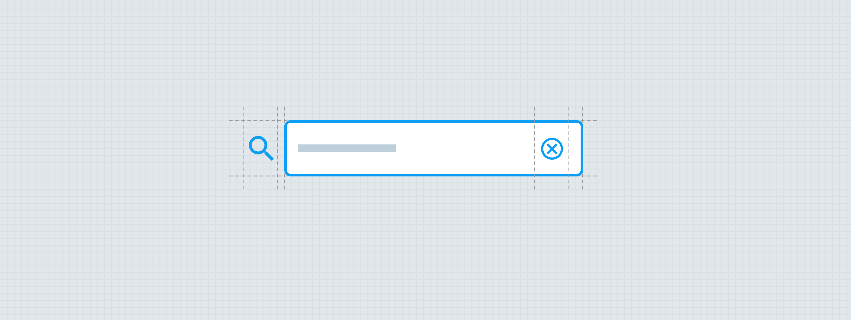
The essential parts of the search field are the trigger and the text field. Every search begins with pressing a trigger, which can be the quick action button or the search text field itself. If the search functionality is secondary to the primary purpose of the experience, the trigger should be deemphasized and not demand too much attention.

- Quick action button - Small
When the quick action button trigger is used to display the text field, a cancel button should also be displayed — allowing the search field to be hidden again. The cancel button is the only way to close out the expanded search field.
- Surface/container
- Leading icon - Small Avatar
- Input value — Body 1
- Clear trailing icon - Small Quick action button
- Cancel search affordance — Compact button (optional for persistent search fields)
- Focus/activated indicator
Small Search
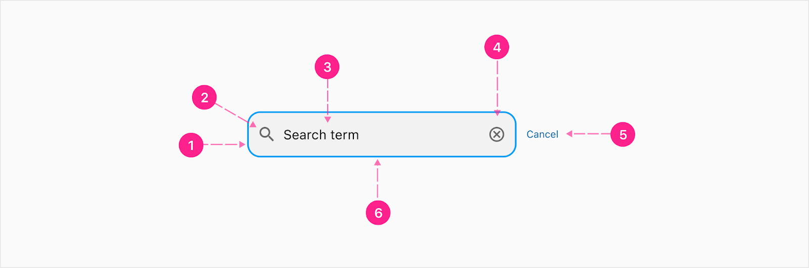
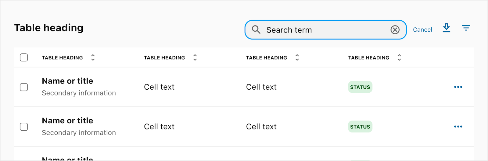
The small search is used for areas where a smaller footprint is needed for searching. The most common use case is in the table header when expanding the search via QAB trigger. Note: Height of the search bar is 40px.
- Surface/container
- Leading icon - Small avatar
- Input value — Body 1
- Clear trailing icon - Quick action button
- Cancel search affordance — Compact button (optional for persistent search fields)
- Focus/activated indicator


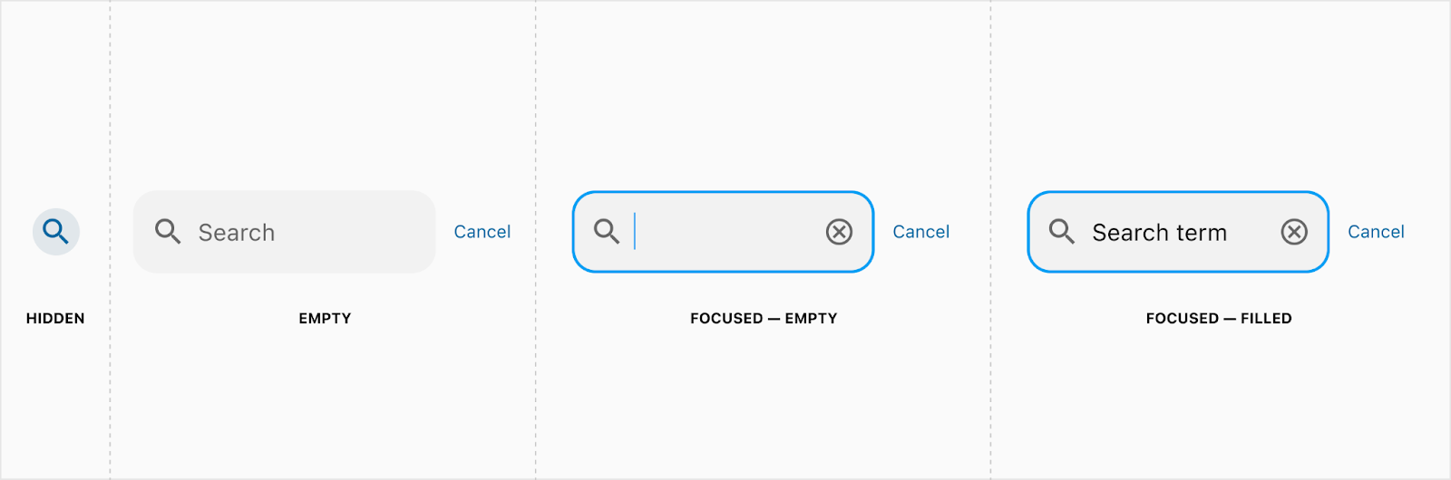
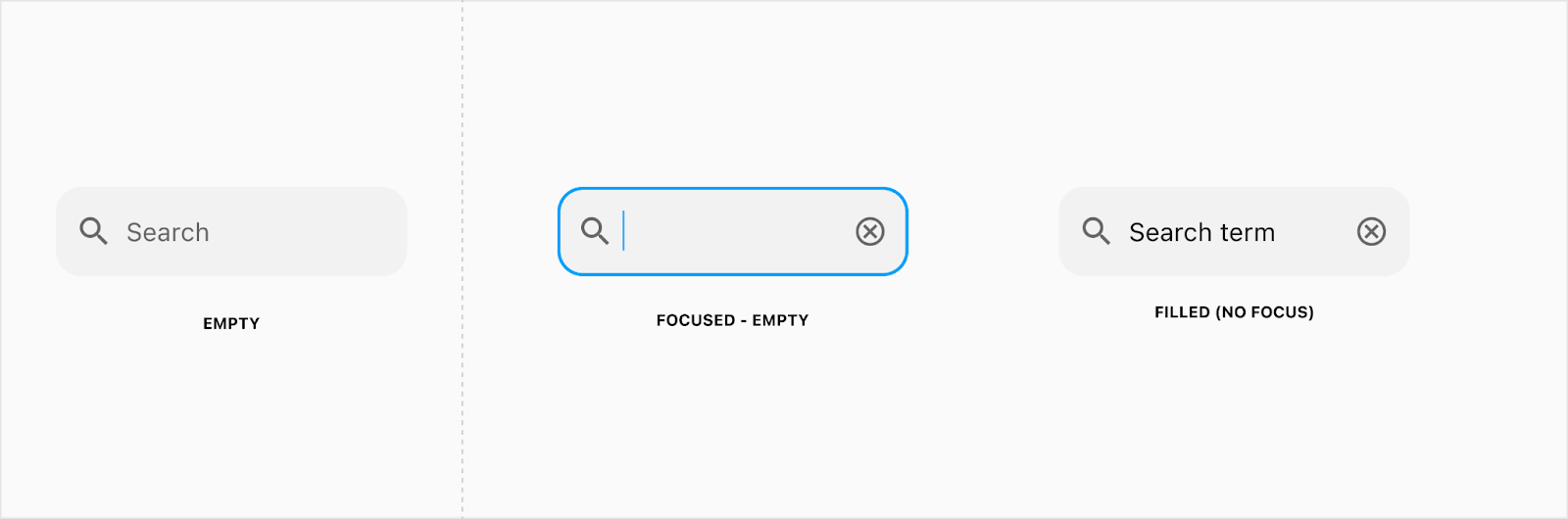
States
All states for the quick action button, text field, and compact button are documented in those component docs. The graphics shown below outline the states for the quick action button trigger (the progression from the search field being hidden until a quick action button is pressed, and then shown with a cancel compact button) and the persistent search experience.
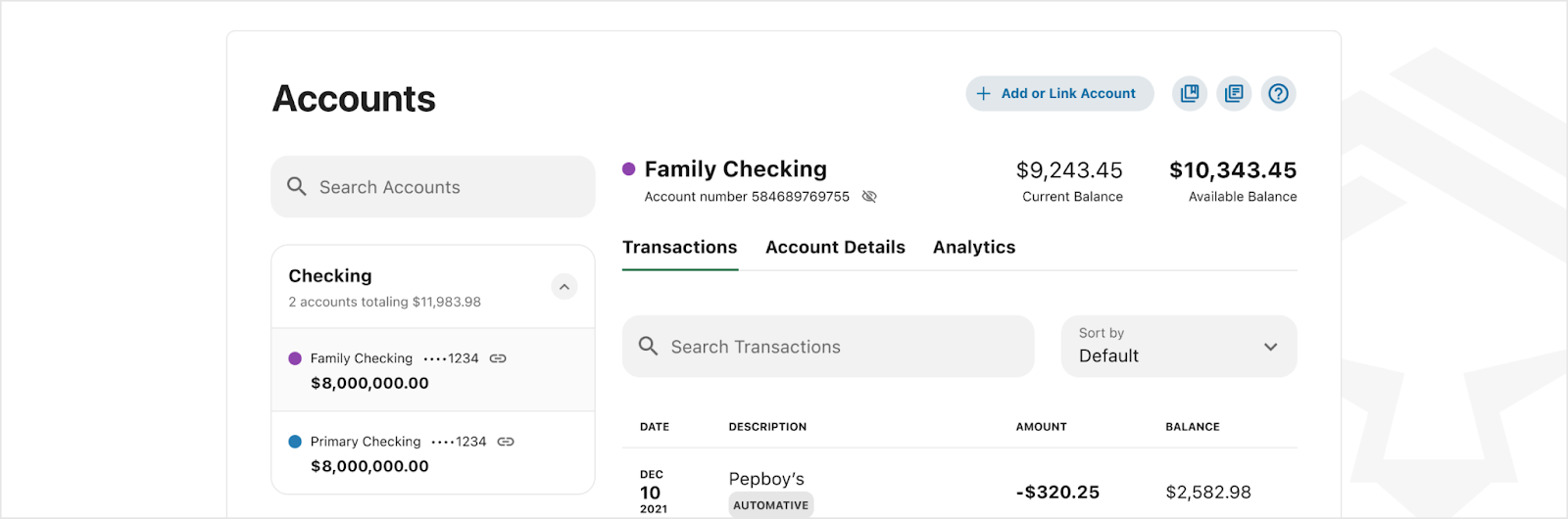
Placement
Search fields can be placed inline anywhere a search is needed, or display persistently at the top of the screen. When displayed persistently, clicking the cancel button will cancel the search and return the UI to the state previously.


.gif)
Developer Docs
Vue Developer DocsComponent documentation coming soon!