Number Pad

Done

The Number Pad is a native-only touch device component for numeric data entry. To create more immersive experiences, the Number Pad should be used in workflows where the numeric entry is the most important element on the screen or context. The number pad should be associated with a display text field but in workflows where you need multiple inputs, use a text field instead.

Number Pad

Anatomy

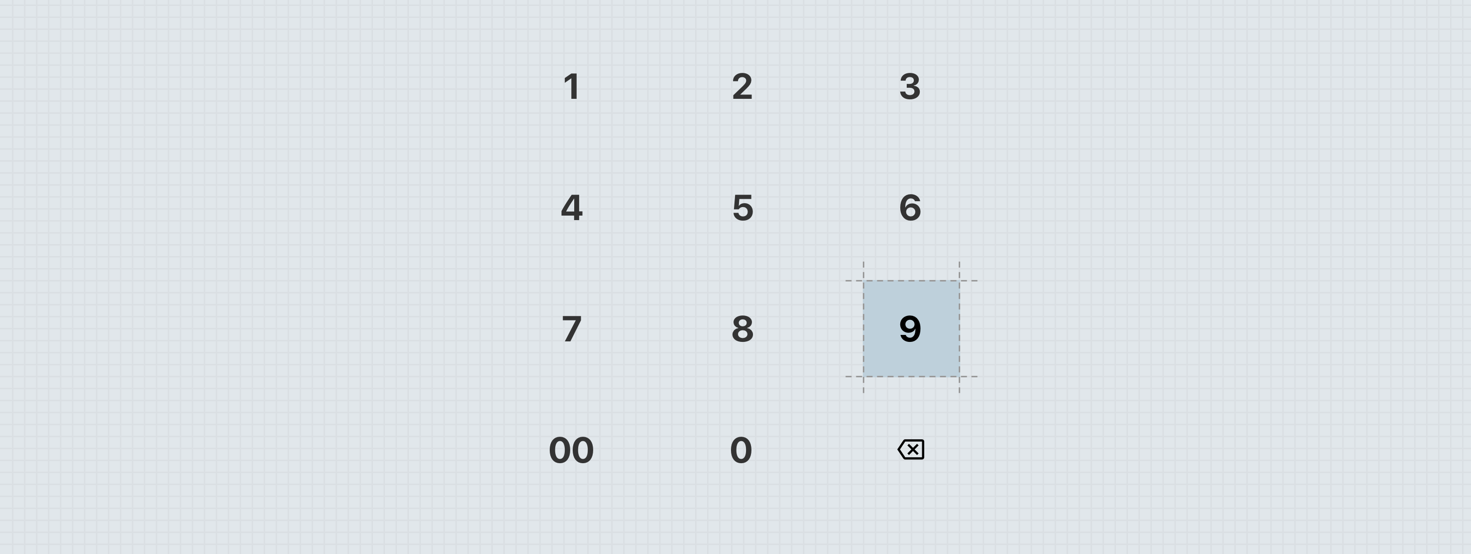
  1. Digits — Small heading
  2. Tap target — Selectable Surface
  3. Backspace — 40px embedded no emphasis Quick Action Button
  4. Double zero or decimal — Small heading (optional)

Specs

Color

Element Property Value
Digit (Static) Color ∆colorBrandedAffordance900
Digit (Hover) Color ∆colorBrandedAffordance900
Digit (Pressed) Color ∆colorBrandedAffordanceOn
Digit (Disabled) Color with Alpha ∆colorBrandedAffordance900, ∆colorPlatformAlpha400
Tap target (Static) Background color None
Tap target (Hover) Background color ∆colorBrandedHover (∆colorBrandedAffordance100)
Tap target (Pressed) Background color ∆colorBrandedPressed (∆colorBrandedAffordance)
Tap target (Disabled) Background color None
Double zero or decimal (Static) Color ∆colorBrandedAffordance900
Double zero or decimal (Hover) Color ∆colorBrandedAffordance900
Double zero or decimal (Pressed) Color ∆colorBrandedAffordanceOn
Double zero or decimal (Disabled) Color with Alpha ∆colorBrandedAffordance900, ∆colorPlatformAlpha400

Elevation

This element should derive its elevation from the parent container.

Spacing

Each tap target is a ∆spacingPlatformHuge sized square. This is a themable shape.

While the space between each row of digits is fixed, the space between each column should adjust based on viewport or container width. The maximum space between each column is shown above. The minimum space between each column is zero, but no modern device should ever require such little space between.


States

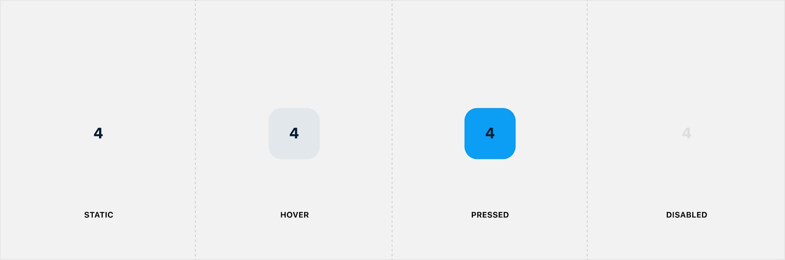
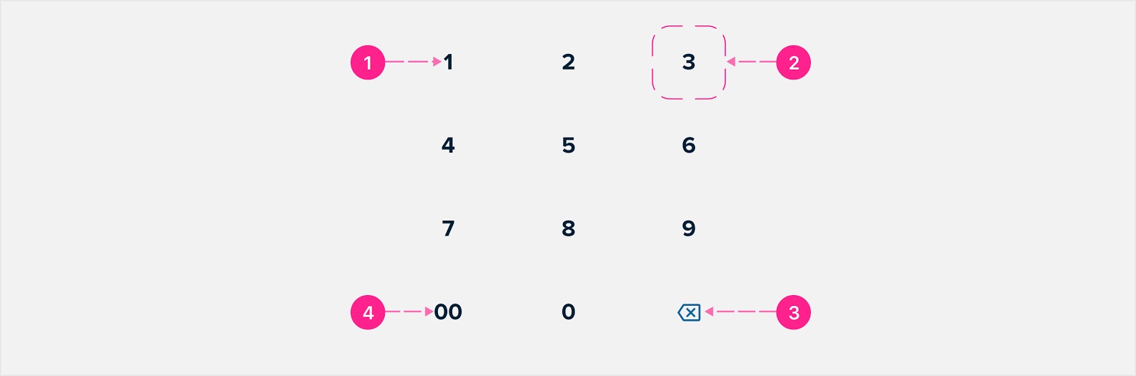
The various states of the Number Pad are implemented at the atomic level. While touch devices traditionally don’t require a hover state, one has been provided for the new iPad OS. When the entire Number Pad is disabled, every target should receive the disabled treatment.

Theming

Color

Element Property Value
Digit (Static) Color ∆colorBrandedAffordance900
Digit (Hover) Color ∆colorBrandedAffordance900
Digit (Pressed) Color ∆colorBrandedAffordanceOn
Digit (Disabled) Color with Alpha ∆colorBrandedAffordance900, ∆colorPlatformAlpha400
Tap target (Hover) Background color ∆colorBrandedHover (∆colorBrandedAffordance100)
Tap target (Pressed) Background color ∆colorBrandedPressed (∆colorBrandedAffordance)
Double zero or decimal (Static) Color ∆colorBrandedAffordance900
Double zero or decimal (Hover) Color ∆colorBrandedAffordance900
Double zero or decimal (Pressed) Color ∆colorBrandedAffordanceOn
Double zero or decimal (Disabled) Color with Alpha ∆colorBrandedAffordance900, ∆colorPlatformAlpha400

Elevation

There are no unique elevation considerations for this component.

Shape

Element Shape category Value
Tap target Medium ∆shapeBrandedMedium

Spacing

There are no unique spacing considerations for this component.

Type

Element Property Value
Digit - Small heading Font family Branded font family
Double zero or decimal - Small heading Font family Branded font family

Placement

The Number Pad should generally appear near the bottom of a view. It is commonly used on a Bottom Sheet, placed beneath a Display Text Field and/or above Buttons. The only time you might consider embedding a Number Pad within a base context is on a tablet device, where the additional screen real estate is generous.

Behavior

Tap response

When a digit is pressed, the pressed state should appear instantly and fade quickly.

Interaction Steps Duration Easing Notes Haptics
Tap 1. Pressed state     Pressed state appears instantly. Light on trigger
  2. State fade ∆motionTimeExtraFast ∆motionEasingStandard Pressed state fades quickly into static state.  


Developer Docs

Vue Developer Docs

Component documentation coming soon!