.png)
Modal
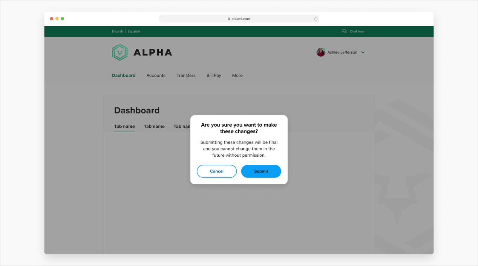
A modal is a window that overlays over the main window to give the user a task to complete before moving forward. There are two variants, simple modal or media modal. Modals are used for desktop interactions only. If you need to involve additional components like text fields then use a side sheet. For mobile native, use a partial bottom sheet.
Anatomy
The user may click the scrim for it to close the modal which will take them back to where they were before but it can be locked down if the user is required to take action.
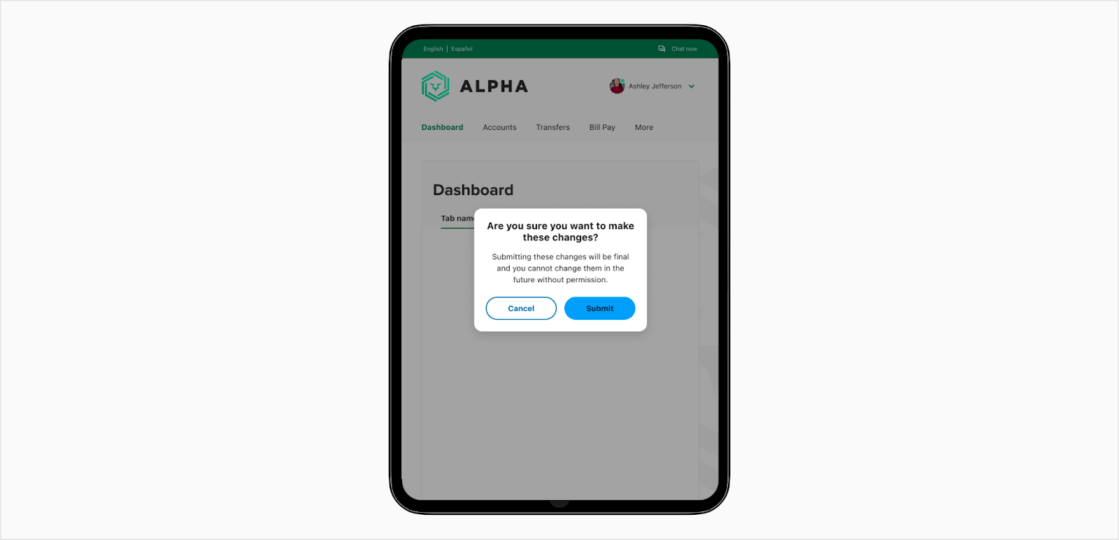
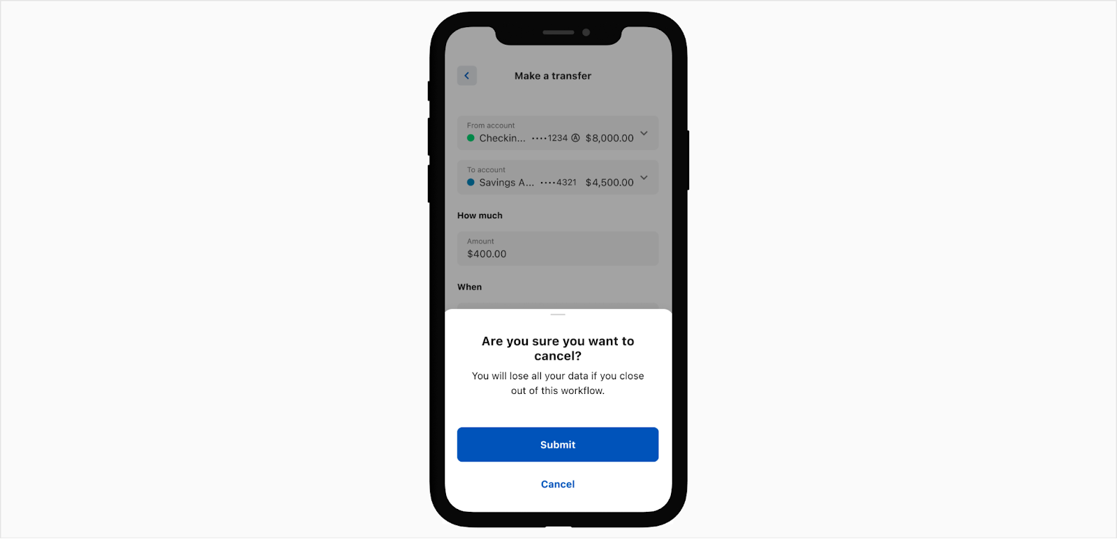
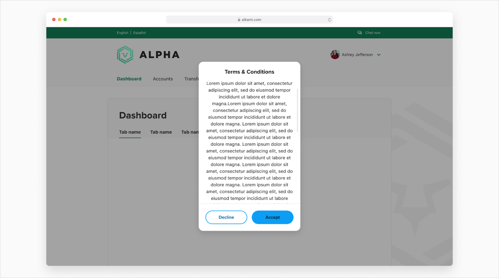
Simple Modal
Use a simple modal when you need to do a quick confirmation task that is usually a yes or no question.
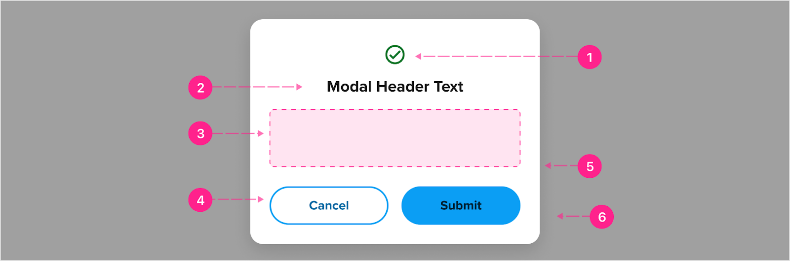
- Avatar - Medium (Optional)
- Heading - Small heading
- Slot (Optional)
- Buttons - Medium and high emphasis (Up to 2, minimum 1 button at high emphasis)
- Container (Min 272px width)
- Scrim
Fixed header
If the content within the body becomes too long, the body container will scroll independently from the header and footer. The header will be fixed to the top of the modal once the modal hits the max height of 600px. A divider will show for the header once the content scrolls behind it.

- Divider
Fixed footer
The footer will be fixed to the bottom of the modal once the modal hits the max height of 600px. The divider will go away once at the bottom of the content.

- Divider
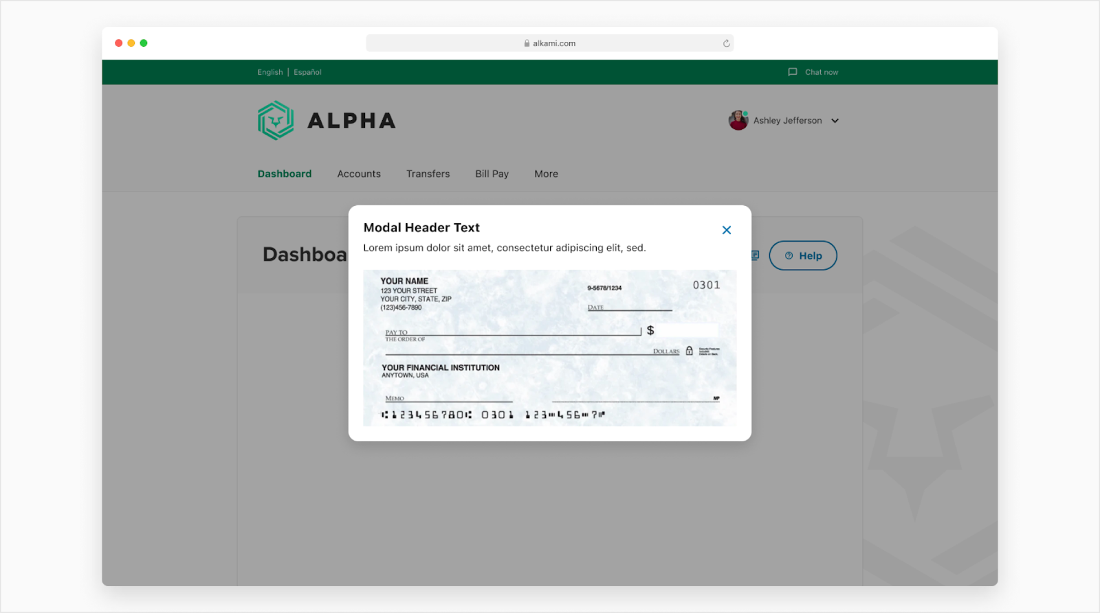
Media Modal
Use a media modal when needing to enlarge some type of media like photos or videos. Note: If there are no buttons then the X at the top right will show but if there are buttons, then the X is not showing.
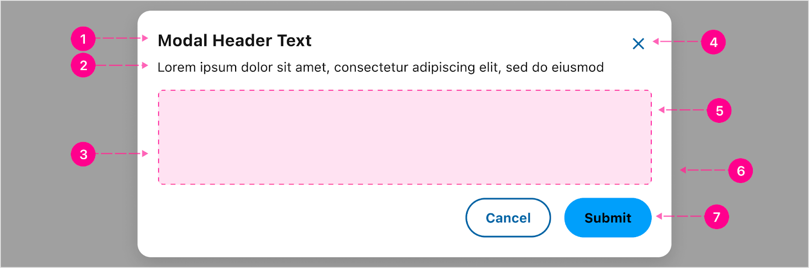
- Heading - Small Heading (Optional)
- Body paragraph - Body 1 (Optional)
- Slot
- Close - Small No Emphasis Quick Action Button
- Container (Min width 272px and max width of 700px)
- Scrim
- Buttons - Up to 2 (Optional)


States
No new states to consider for modal.


Placement
Desktop placement
Modal is vertically centered within the browser window or sidesheet and the user cannot scroll the page while the modal is open. Desktop screen margin padding is 40px.
Tablet placement
The modal is vertically centered within the tablet view and the user cannot scroll the view while the modal is open. Tablet screen margin padding is 24px.
Mobile placement
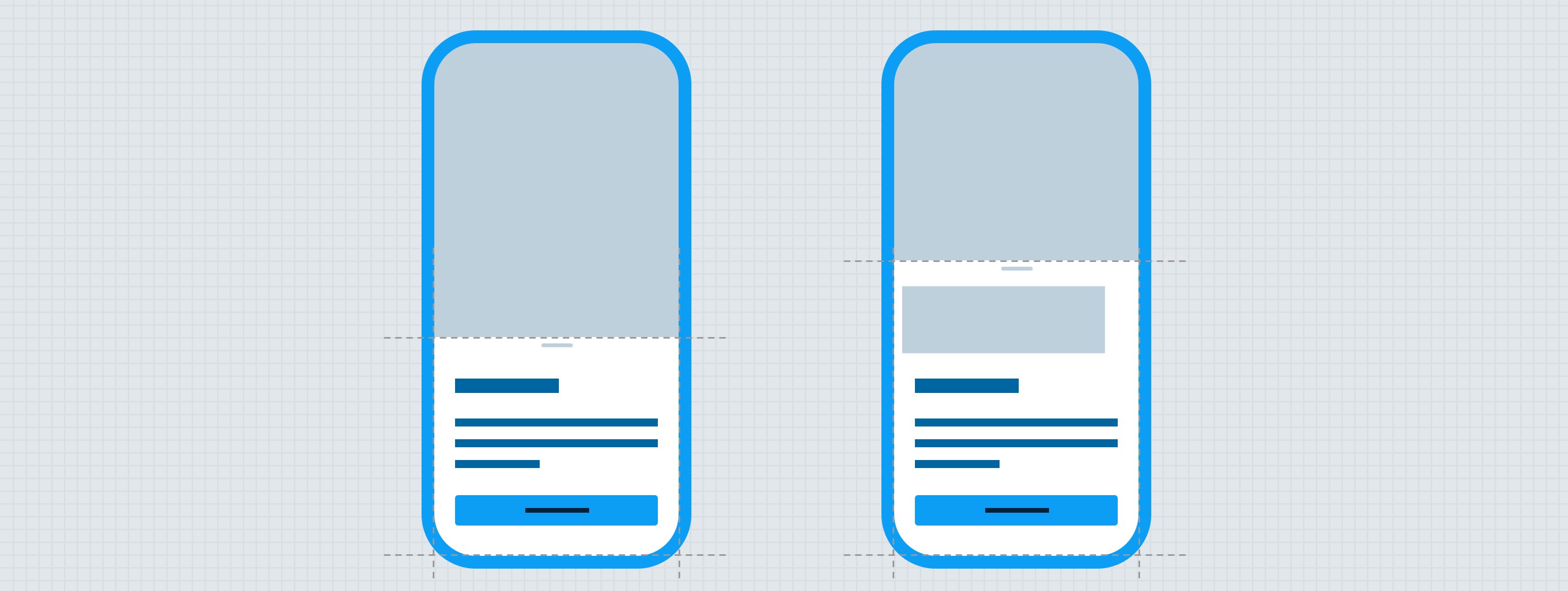
The modal will open up inside of a partial bottom sheet on smaller screens. See this documentation for the breakpoints.
Vertical height
The modal will get taller the more the content is inside of the body paragraph but will start to scroll within the body once it meets max height of 600px.
Side sheet
A modal can be used within a side sheet and be used to prompt a user when necessary. For example, when you try to exit the side sheet without saving any changes.


.gif)
Developer Docs
Vue Developer DocsComponent documentation coming soon!